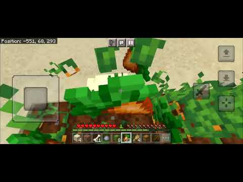
Hello there everybody existing back again joining by bean dream for another wallpaper competition review and showcase the theme multi-dimensional all right bean take us away first up we have one by win yeah i feel like the minecraft rendering on this one is not doing it justice i honestly didn’t notice until now There’s like tiny pictures in it yeah it’s got like little screen shots in it any little photographs just oh that looks horrible zoomed in on it seems like there’s kind of a split between kind of the overworld the top left the end and the bottom and the Net on the top right that’s what i’m gathering from this yeah it’s almost like the two dimensions are interacting yeah it’s a little bit chaotic yeah this one’s like a treasure trove the more i look at it the more i find which is interesting next up we have one by Reven arvin i’m gonna say raven raven that makes more sense i’ll be honest one thing i’ll say about this one despite the uh minecraft rendering the poses are really good this really looks like a picture that was taken of a scene in motion that’s true everything feels organic Do you like the gold falling out of the chest nice little touch there the effect of the other dimensions showing through the portal instead of it just being like the normal nether portal texture is also like top notch although i’m not sure if the perspective in there is correct It’s close enough but it does look a little old or maybe i’m just dumb i like the idea that it’s not completely lined up because it gives it that more of like another dimension rather than like you’re just looking through a frame true kind of seems like you know they’re coming from another Dimension and it’s a bit you know off kilter the lighting in the scene is honestly pretty good although it does make it feel less of a darker scene even though it looks like he’s getting stabbed and everything yeah that is one thing i would point out is the lighting From what i can tell in the character on the ground’s eyes being open it gives it a rather odd juxtaposition tonally it seems kind of like happy lighting and character with the big eyes and they’re open and it appears that the pikmin guys have murdered him coming out with their looter Or taking their loot back or something and uh so it’s got this kind of weird kind of mix of tones next up we have one by it’s blue fin dude i can’t help but notice you put an exclamation point on the it’s hey that’s the way it’s in discord That’s the way it’s going to be in here i thought i don’t mean professional nope so this image was a bit questionable you would say this theme is multi-dimensional not just like another dimension however it does kind of feel like a different dimension without the floaty light things yeah this one kind Of leaves a little bit of like to interpretation i guess where you have to say okay is this like one dimension and these orbs are from another dimension it doesn’t really tell you any of that it just kind of puts it there and you have to pretty much fill in the blanks yourself So that’s what made it kind of does this for the theme or not but i’m assuming the theme being what it is that that was the idea to be fair it was a pretty difficult theme just go around so unfortunately i can’t really tell a whole lot by looking at Minecraft here it seems like the lighting is a bit flat to me the lighting in the front here with the grass is okay but back in the trees they’re really it doesn’t get much darker there’s not like enough shadow so it is a little flat i feel Like with this one with the orbs there should probably be very little ambient light and most of the light source would be coming from the orbs themselves next up we have a al nightmare a a l nightmare another one where it’s kind of split into three different Sections we got the nether we got the overworld outside and i guess this is down in the caves yeah i would say the way the splitting of each scene is done is pretty interesting it’s not just straight lines everywhere this one it fits the theme because there is like another dimension and the Overall dimension but the split scene for the overworld dimension kind of doesn’t make sense to me it’s two panels that are basically the same dimension just two different places in that dimension i feel like there’s a kind of a difference now it would be better with the end just to match the theme There’s a lot more going on in the nether scene than in the other two yeah everything just looks different in the nether which just makes sense but it definitely is lacking in the cave one everything’s just kind of dark and you don’t really notice it Yeah i think this one if you had made that third panel down there more like a something else like the end or whatever it would have helped a lot because as it is it kind of looks like two scenes from the overworld in a random nether picture slapped on to it I do really like the nether one though next up we have one by uh station magic this one is It’s a portal you could say this is lazy and maybe it was but i do think it’s interesting in that the portal is such a focus like a subject of the the picture and i think maybe it’s kind of the composition of the the camera and everything it does Kind of stand out and look interesting to me for some reason it’s like a a very vague interpretation of the theme it’s like a mysterious you know if you didn’t know minecraft was what it was you know and that’s what another portal is you’d be like oh what is this mysterious Portal that goes somewhere yeah i think though what would help with that is to have like uh one of the other ones be another showing through the portal yeah that would definitely would have uh boosted it a bit and definitely helped to kind of comply With the thing better i do like the uh lighting on the tree it’s honestly more noticeable in the minecraft one versus the actual render but there’s just weird purple around the portal though which is a little odd i’m assuming it was intentional because i don’t know how you would get that in Otherwise and the lines from the lighter here are a little harsh but i do like the lighting in general of the scene the composition also is pretty good i just would have put a another throwing through the through the portal and some of the purple lighting next then we have one by taki I like the top right panel with the ender dragons being so out of focus gives that very much noise ominous look it does look like all the images were kind of just slapped on top of each other rather than actually cropped out to be the same size i feel like it would be Okay but the top left one overlaps at the top right where i feel like that should be cut directly on i think that having this one be a bit more stylistically incorporated or turned into a collage rather than them being kind of mis mixed mismatched all right whatever you say mixed and Matched over each other it looks a bit sloppy and kind of like you just made several different images and tossed them on on the table instead of making it more of a presentation we have one from the nether which i kind of actually like how Dark it is that’s kind of how i always imagine the nether looking the main issue i see with the one in the nether is the smoke particle effect on the torch by default in monomator the scale of that is just a bit too big So i would have scaled it down a tad so it’s not such a intrusive effect on the uh overall image i’m assuming you removed the background which is like the actual flatlands grass but you gotta put like just a little bit in the in the background just to hide the uh Horizon this one is by the uh self-proclaimed blender hater yeah that guy every time he’s like for no reason in discord he just brings up how much he hates blender we love blender around here i don’t know what he’s talking about yeah it’s so weird This one i only realized it now but it looks well maybe that’s not even accurate but uh i guess the border is like a pumpkin on your head or something that’s what i was wondering about the lines in it and stuff it’s a bit intrusive too much is covered up or Something and i’m assuming you know it was being used to separate the images in an artistic way but i feel like it’s just too intrusive like it covers up his face here and it it would feel better if it was like in the background but it’s like Just plastered on top which is where it gets a little messy i do like the fire just raging in the background in the nether one yeah i agree that really stands out i think that’s probably my favorite panel out of this that one on the left there Wither skeletons and blazes are kind of cool in my opinion anyway and then having the flame back there the end one not much is happening there’s really not any lighting going on yeah that one was a bit foamed in it’s like he was like oh enderman Uh ender dragon that’s the end i think the middle one would actually look pretty good but the black uh overlay again just kind of hides too much yeah that’s the main thing like the black smear going through the middle between them it really kind of just creates A dysfunction for lack of a better word in the image like it separates them too much when that should have been the core panel in the middle that kind of draws your eye in we have one by zesty coronet now the first issue i notice here is there’s a bit of a minomator Watermark poking through the bottom right of the top panel oh i didn’t even notice that so that makes me wonder was this done in this way to hide the watermark or was this an artistic choice because you can turn the watermark off you don’t have to Hide it first thing that i noticed is that there’s that basically just one scene lighting and there isn’t actual uh there’s hardly any shadows anywhere yeah i’d be interested in hearing like what was done here because to me like on first glance it looks like either cast shadows was turned off Or like brightness for the scenery object was turned all the way up so that there’s no shadows that’s pretty much the extent of my critique of this one though is that the lighting is very flat and the weird cropping and the watermark yeah like i thought it was intentional as Like a way to present the image at first but now i’m wondering if it was just kind of uh art through adversity but uh yeah the lighting is very flat in the image like the the contents of the image the scenes the things that are happening in the scene They don’t really convey anything to me it looks kind of random and the cropping just kind of cuts off the action that’s happening in the nether there the composition of that shot like the one in the middle there the enderman is really tall and the characters like the human characters are At the bottom so like you’re trying to encompass all that with this really wide aspect ratio so the camera needs to be moved characters need to be moved something needs to happen to compress all that into the frame that you’re trying to create yeah i would have just cut out the Enderman from that one thinks you have enderman in the bottom one yeah the enderman is a redundancy so he could be gotten rid of we have one by mu bloom so i’m trying to understand this one the portal doesn’t go all the way down to the bottom of the image So it’s it’s a split screen and i like that first impression i was like oh this is split by the portal like on the left side you see the overworld on the right side you see like where the portal leads to but it actually is just in the scene like the portal is Does not go all the way down to the bottom splitting the scenes it’s just kind of artificially split yeah and you really can’t tell it here but the portal and the nether goes down an extra pixel ah for some reason so actually so i don’t know a little bit easier to Do what i was saying yeah just to make the portal go the whole way and it would kind of separate the two the other thing is just this glow on the nether portal is only in the nether and not in the overworld i would say both scenes feel kind of empty as well Like the overworld one you could have it be just what it is but in the nether one i feel like you know there’s this idea that i’m getting from the image just like hey this is this epic place where the portal goes that this is where he could be heading to So having mobs or something that kind of aggrandizes that dimension would have sold this effect better you can tell it’s the same in the same world because the uh the background lighting is exactly the same in the nether and in the overworld yeah the scenery for the nether was cut off So that you get the sky in the background that’s definitely uh an element that takes you out of the scene here next we have one by awkward bunion this one’s just crazy i don’t know what’s going on with the sky i don’t know how you even did that i Like the look of this one it’s a bit overpowering especially on the characters i feel like it would be more interesting if the environment had the stronger effect and the characters had a little bit more like a retaining of their more natural look with just this kind of being a highlight around Their original textures or something it’s definitely hard to look at and it doesn’t really have a centerpiece that you can just kind of focus on i really like this lantern down here it just looks so cool yeah the lantern looks badass like that’s something the effect worked really well like That’s probably the best outcome of the effect is on the lantern it’s another dimension but doesn’t really uh the multi-dimension element but yeah well still cool if you have the characters retaining a bit more of their original textures and it kind of shows them being an element of the normal minecraft dimension and They’re inhabiting the space that’s more crazy and psychedelic looking it would have helped sell the overall effect of the image and it would have helped i think comply with the theme better we have one by bling plays so it’s got a lot of uh chromatic aberration howard’s chromatic fashion which i’m gonna be Honest i love using but anyway this one definitely does what my critique was of a of a few of the previous ones which is each panel has a lot going on to represent the dimension that it’s supposed to be portraying one of the things i would say Like this could be a happy accident but it sticks out to me as compositional knowledge or skill a little bit of artistic skill or talent or experience and that it’s not presented linearly where you know the overworld image is in the middle it takes the focus and then the peripheral dimensions the End and the nether are in the corners however with the middle being the focus there should definitely be some brighter lights in there it kind of feels dark yeah i can uh lighting on like the one side of the skeleton and the zombie just to bring out the Elements that are happening in there i like this one in terms of like how it’s presented the fact that each panel does a lot at least with characters and mobs to illustrate where it’s supposed to be based in and what the characters that exist there are kind of all about Next up we have one by brickabang so right out of the gate here i would say thus far to me this one kind of inhabits the theme the best yeah definitely uh all in one image gets the multi-dimensional theme like fits it all in one image without having To separate everything yes it’s all represented here i like the idea that it’s mirrors so it’s not the traditional like oh he’s looking into a portal of some kind it’s like he’s looking at a reflection of himself that is actually in itself a portal to another dimension that he exists in It’s a very cool concept and i think it it does the the best so far to succinctly capture all of that into one image like he doesn’t even have to use multiple panel images or anything it’s all one image all being captured in one shot that’s Really cool the way he did this one the biggest thing that i noticed first is the uh shirt it has weird artifacts on it the other thing it appears that you used a pen tool of some sort to trace that around these to give them a lower saturation and lighter Because they’re not straight lines for the mirror nice catch and they uh overlap here on the cobblestone well disqualified this one is by dr heck this was the most questionable one to me as far as what made it into the comp here in that it doesn’t really portray multi-dimensions at all other Than the fact that the character is in a different dimension than the overworld yeah it was hardly fitting the theme but once again difficult theme so it’s as far as this takes true but as far as this take on it i think what i would Do if you wanted to make it more simple take characters that are known for their particular dimension and then mix them into one so like if you’re gonna go with the nether then maybe you have the human character and instead of fighting a wither skeleton he’s fighting the ender dragon So something that kind of indicates a mingling of dimensions rather than what you already know in the game which is you can go to the nether and fight with her skeletons in regards to the scene itself there should definitely be more like lighting on the wither skeleton and the uh player more Harsher brighter lights just to show that their faces better but in the background i do like that there’s actually a light shining from the hallway back there yeah the lighting for the hallway is probably the the highlight of the image and that it gives Depth and kind of almost like a bit of a mystery it’s like oh what’s down there yeah it’s like i just want to see what’s around the corner now the character’s pose is kind of rough like his arm bent back the way that it is because it looks very uncomfortable Broke all his bones all right we’re gonna do the uh third place second place first place again sounds fair for the winner uh oh i have decided on brickabang [Applause] Second place i’ve decided on uh raven one one nine rv raven arvin 119 and in third place it’s a split between win which time for third exactly win and bling plays bling plays when time for third place all right so the winner will get the a uh discord roll on the discord for Winning and your brickabank gets to choose the next theme i’m gonna have to change his role from not the winner damn it no sad day i’m just gonna kick him once again if you want to participate there will hopefully be a discord uh link in the description if it’s not you Can yell at cynic yes there’ll be a discord link in the description of this video there’s a discord link in the about page of the channel if you can’t figure out how to join and how to submit that’s on you at this point i’ve done all i can do unless you pay me Time to make a tutorial on how to join your discord server Video Information
This video, titled ‘Multi-Dimensional – Minecraft Wallpaper Competition’, was uploaded by AnxiousCynic on 2021-05-25 19:00:16. It has garnered 1077 views and 82 likes. The duration of the video is 00:21:14 or 1274 seconds.
Check out these multi-dimensional themed Minecraft wallpapers from the community!
https://www.patreon.com/anxiouscynic
Join the Discord: https://discord.gg/CNuQYwh
Other social media: https://twitter.com/AnxiousCynic http://www.twitch.tv/anxiouscynic
Main channel: http://youtube.com/AnxiousCynic Vlog channel: http://youtube.com/AnxiousCynicToo Second Animation channel: http://youtube.com/BoxSpringAnimations